Problems We’d Like to Have: Where Do I Fit All My Medals?
When I lived in New York City, publishers were a dime a dozen. Big publishers, little publishers, a whole slew of them are located in Manhattan (with a couple in Jersey and a few in Brooklyn). You get jaded when you live there. Then you move away and it’s a whole new ballgame. Oh, you can find other publishers around the country. There’s Lerner in Minneapolis and Chronicle in San Francisco, to name but a few. The Chicagoland area is a bit trickier. I’ve found a couple folks here (Albert Whitman, Chicago Review Press, etc.) but it’s definitely a smaller number than I expected.
Then I discovered Agate Publishing.
It seems crazy to think that Evanston, IL, the little town in which I reside, has managed to produce a publisher that in 2018 won a major children’s literature award or two. Or five. In 2016 Agate Publishing announced a new imprint: Denene Milner Books. As the press release at the time put it, it was, “a new line that Agate will publish in its Bolden Books imprint, which is devoted to the work of African American writers. Our plan is to launch the line by publishing four titles per year in the categories of children’s books and fiction and nonfiction for young readers of different ages.” They started off with Early Sunday Morning, which was a good book illustrated by none other than Vanessa Brantley-Newton. But nothing really prepared me for Crown when it debuted in 2017. Nothing prepared Agate either, I warrant, because when the awards started coming in, they clearly had a problem. Where the heck were they going to put those medals?
ADVERTISEMENT
ADVERTISEMENT
Medal placement is a problem few of us have to face in our day-to-day lives. But for a winning publisher, it can be a major chore. Let’s say you have a busy cover. Lots of stuff going on. Maybe a prominent face. You don’t want to cover up the main character, but at the same time you don’t want to leave off any medals. Apparently ALA committees get a bit peeved if you opt out of showing off the shiny stickers they worked so many months to award. So what was Agate to do about Crown?
To answer that, let’s look at what a couple other books have done with their medals in the past.
In 2010 Rita Williams-Garcia’s marvelous One Crazy Summer hit bookstore and library shelves. This wasn’t the author’s first book and it certainly wouldn’t be her last, but it was definitely different from her previous work. I remember how they sold it at the Harper Collins preview. Their exact words were, “The Penderwicks meet the Black Panthers.” As it turned out, it was a marvel. Worthy of all the awards you could pile on it, and pile on they did. Suddenly this:
… turned into this:
And that’s not even including the Scott O’Dell Award it garnered. Clearly something had to be done. The solution? A clever, yet subtle, redesign of the jacket:
See how they shifted the title ever-so-slightly to the left, to make room for the row of awards? Beautifully done. And then the book when to paperback and they could actually design the jacket with the medals in mind:
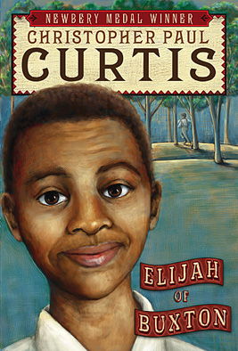
Let’s take another example. In 2007 Elijah of Buxton was released, making it the latest and greatest in the Christopher Paul Curtis oeuvre. One wonders if the publisher had any notion about the book’s delights, though, because this was the book jacket they gave it:
After all these years I’m still puzzling over what they were going for here. I think they thought it was akin to a piece of later 19th century folk art, but that’s just a guess. In any case, they were setting themselves up for trouble. How much room do you see there for medals? This cover sports a whole lot of stuff you are not going to want to cover up. And when the awards started rolling in, the results were less than entirely worthy.
Something had to be done. You can’t really shrink the medals down, which is a pity since teeny tiny medals all over a book jacket would be adorable. The only thing to be done was to redesign the cover altogether. And so this image was exchanged with this one:
Once again, it’s the Scott O’Dell Award that takes the hit and disappears. But that’s still a great cover. A vast improvement over its predecessor.
ADVERTISEMENT
ADVERTISEMENT
The trouble for Crown, though, is that One Crazy Summer and Elijah of Buxton are novels. Crown can’t really come back with a wholly different cover for its paperback edition, for obvious reasons. That meant redesigning it in the same way that the original One Crazy Summer book was redesigned. I had the pleasure of sitting down and speaking with some of the publicity coordinators of Agate, Jacqueline Jarik and Deirdre Kennedy, and they informed me that their designer actually has tweaked the cover a bit. So, you’re hearing it first, folks. Here is the new Crown cover, shiny medals and all:
Clever, right? The circle of crowns now becomes a circle of award seals. According to Agate Publishing, “our reprint will feature those four seals, plus an updated back cover.” They were also careful to space the seals in such a way as to allow the original crowns the chance to peek out from behind them.
But maybe my favorite image from all of this is one that you probably won’t see much of anywhere. As Deirdre told me, “After the announcements we made a graphic with the seals on that page but we haven’t done anything with it yet.” Seems to me pitch perfect in every way.
By the way, it is curious, is it not, that all the examples of book jackets feature black faces and creators. What are we to infer from this? I selected them because they are the three best known examples of lauded books looking to find places to put their award seals, but do these problems stem from publishers’ unwillingness to bank on critical praise or is the answer simply that I personally remember these books better?
What are some other examples of book jackets that were unprepared for the onslaught of acclaim? Let me know your favorites.
Filed under: Uncategorized
About Betsy Bird
Betsy Bird is currently the Collection Development Manager of the Evanston Public Library system and a former Materials Specialist for New York Public Library. She has served on Newbery, written for Horn Book, and has done other lovely little things that she'd love to tell you about but that she's sure you'd find more interesting to hear of in person. Her opinions are her own and do not reflect those of EPL, SLJ, or any of the other acronyms you might be able to name. Follow her on Twitter: @fuseeight.
ADVERTISEMENT
ADVERTISEMENT
SLJ Blog Network
Name That LEGO Book Cover! (#53)
K is in Trouble | Review
Fighting Public School Book Bans with the Civil Rights Act
Take Five: Middle Grade Anthologies and Short Story Collections
ADVERTISEMENT


Yes! Love the way Crown looks with all these medals. Absolutely perfect! I wonder about Long Way Down. Similar problem–so many medals this year. Wonder if they’ll redesign the cover so the medals echo the elevator buttons…
March Book 3 also encountered this “problem”.
Did you see how, in the third image of “One Crazy Summer,” Rita Williams-Garcia’s name is spelled wrong? Hopefully, they corrected this during publication! Love this post. Love that book.
Oh my! Quick sighted, you are. I completely missed it. Gosh, I should do a post on books that make it to publication with obvious cover and spine misspellings. There have been a few.
I bought “Crown” for my public library based on your review. I live in an area where blacks are the majority, and thought this would be a great book. Especially since I have had parents specifically ask for books with black boys as main character, that their child could identify with.
I received the book before Thanksgiving. Put it front and center on the new books display in the children’s area. In 3 months it has not checked out once.
Another case of books that adults think are wonderful, but not what kids want. Unfortunately, I am not at that library on a daily basis to hand sell it, so there it sits.
My advice? Buy some of these shiny stickers and plaster that puppy (which is easy to do since Crown doesn’t have a jacket, so you won’t have to fight with any mylar sleeves). A parent that might ignore a book when it’s plain might be drawn to it if it shines. Also, have you used it in storytime at all? In my experience a shelf sitter read well in a storytime suddenly becomes a go-to book. I wish every book sold itself, but sometimes you need to get behind it and push with all your might, just to get it started.
I have to admit that the cover of this book turned me off completely and I never sought it out until the reviews and rewards started to pour in. Now I can’t wait to actually open it up and discover what the raves are all about. Perhaps then I will see the cover in a different way. I offer my experience in case it might apply to your situation. Perhaps it must be hand sold. Such a shame if that is the case.
At my school my Caldecott Club (3rd-5th graders) selected Crown as their winner. My Newbery Club (5th graders) also gave it serious consideration. I believe it was reading the book aloud that brought this book to life. The language is positively resplendent. My kids responded to it effusively–even though most of my students are not black. One of my Newbery Club kids said after I finished reading it: “Well, just slap the medal right on that one.” She was right! Except it would have been more accurate to say “medalS.” Try using it for a storytime. That might get it moving. 🙂
This is FASCINATING! Isn’t it still missing a CSK? Or do you think they smooshed the two into one medal? Incredible work.
I think you’re right on with that smooshed theory. Since it Honored in both art and writing, one medal can potentially stand in for both.
What about Last Stop on Market Street?
Deborah Heiligman tweeted about having this happy problem with Vincent and Theo today https://twitter.com/DHeiligman/status/968518997435142145?s=20 .
I think BOMB by Steve Sheinkin was designed FOR medals. It had no trouble adding on the multiple award seals. Either did Deborah Heiligman’s CHARLES AND EMMA. MARCH, however, gained 5 medals. No book – no matter how beautifully designed – could fit 5 medals without making the cover congested.
And don’t forget Jacqueline Woodson’s BROWN GIRL DREAMING! The cover of that title accommodated Newbery, Sibert, CSK & National Book Award stickers with room to spare!
Wow I never thought of that medal placements would be a such an issue! I wish I had that problem. I do recall being irritated when shelving books at the bookstore- when I’d come upon a medal stuck right over part of the title or the author’s name. I love the solution to redesign the cover with medal placement in mind.