Discussion: The Reasons Behind a Choice – Meeting With the Illustrators Exhibition Jury 2022
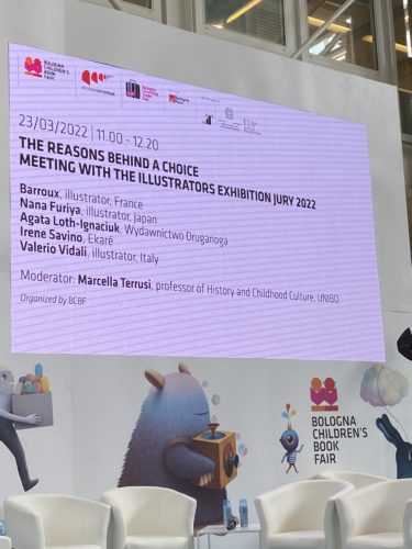
If you saw my brief encapsulation of a selection of the art included in the Illustrators Exhibition here at the Bologna Children’s Book Fair then you may be curious about the process. As I was quick to discover, American children’s books were submitted, but only one single book included (kinda puts you in your place, which is not a bad thing). But how did the panel decide on what to and not to include? This panel provided a glimpse into the criteria and how you go through 3,873 artists from 92 countries (they’ll say other numbers during this talk, but that was the official count).
The panel was moderated by Marcella Terrusi, a professor of History and Childhood Culture, with the jurists Barroux (illustrator, France), Nana Furiya (illustrator, Japan), Agata Loth-Ignaciuk (Founder and Editor-in-Chief of Druganoga Publishing House, Poland), Irene Savino (Art Director of Ediciones Ekare, Venezuela), and Valerio Vidali (illustrator, Italy). On a personal level, the only person speaking on this panel that I was already familiar with was the work of was Barroux. You may have seen his book out this year, I Love You Blue or my personal favorite Where’s the Elephant?
ADVERTISEMENT
ADVERTISEMENT
I’ll try to relay everything I heard before, but if there’s a takeaway from this talk, I believe it highlights a very essential difference between how this jury chooses to judge art vs. how we prefer to judge our children’s book art in the States. And the key point here lies in submission. Artists did not submit their books, with their works in context. Rather, they were only allowed to send in five pieces from a single book. And while there was some talk from some jury members (significantly, not all) about how the five pieces related to one another, text is considered completely superfluous.
Now just yesterday I was telling someone how my Senior art project in college was completely based on how the title of a work changes your perception of it. The influence of text on interpretation and maybe even appreciation. So you can understand why the notion of taking art from the text (if there is any) and then judging it without context strikes me as odd. At one point in this discussion Valerio Vidali confessed that when he found out how one of the pieces actually worked when he saw it in person, he realized that he’d completely misinterpreted its meaning. This makes me wonder a lot about our own homegrown art exhibits. I imagine the Society of Illustrators’ annual show probably does something quite similar. Note to Self: Interview one of them in the future to learn more about their process. It is NOT how the New York Times / New York Public Library Best Illustrated List is determined, FYI.
Related, I have noticed throughout Bologna that what the judges of this fair tend to prefer is more esoteric art. Art that invokes feelings or sentiment or memory. They would tell you that Americans don’t care for these books. That we prefer plot and structure and rising and falling action. To a certain extent they’re correct, but it’s worth considering the context here. Though this is an international fair, it’s hosted by a European city. As such, the selections by this jury will reflect their own perceptions. And it is not crazy to think that what evokes a poetic response in someone from another continent is very different from what evokes one in me, an American. This begins to get into the idea of where culture intersects with art, whether it’s music or poetry or children’s books, and to what extent anyone can declare the art on display here to be indicative of anything. Which they admit! More than one panelist freely admitted that this list is not a “Best Of” by any stretch of the imagination.
Lots to chew on then. Here’s what was said (and, again, this is an encapsulation of their words, sometimes verbatim, sometimes not). Caption when possible.
Moderator Marcella Terrusi: A jury is asked to become a group, and their eyes are asked to become a single pair of eyes. That’s why the process of the jury’s work is so interesting. I want to start this conversation with Irene. Irene you selected some of your favorite images. We asked our jury members to bring some of their choice illustrations. My interest is in hearing how your professional experience was part of the selection process. What was your impression and the discussion with your jury colleagues?
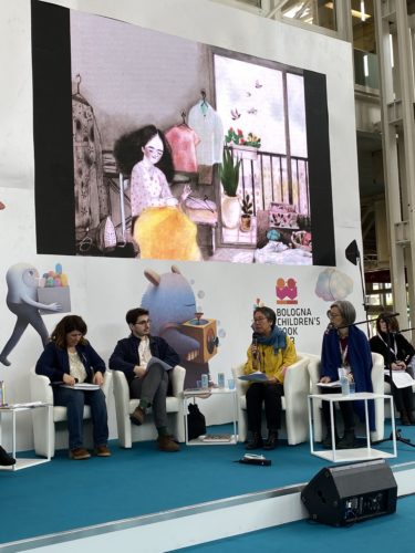
Irene Savino: We had to find five images for this talk. I could talk to many of them, but there were only five that could be selected. In this image here this is a very elegant, beautiful work.
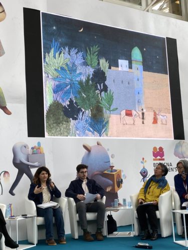
I see in it traces of the Persian culture revisited and with a contemporary point of view. Here she uses space in a different way. The use of space is usually flat but here we see perspective. There’s almost a hint of Escher as well, but certainly the accent is on the spatial dimension.
Another thing I’d like to underline is looking at this image takes time. It’s not something that hits you like a poster, for example. You have to take time, and that’s one thing I’d like to underline.
This one here is by Amanda from Mexico. I found her images very fascinating because there’s a freedom there. Her way is very open. She’s trying to find her own voice, and that’s what attracted me. It’s not so much what she shows in the image but how she draws it that’s attractive.
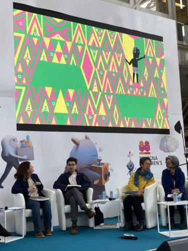
This is from The Bird of Lies by Dale Blankenaar of South Africa. And what struck me about his images is the contrast between characters, which are very friendly, and the geometrical forms. This runs through all the images he sent in, this contrast between the shapes and characters. And, of course, the shapes go back to the patterns on South African fabrics.
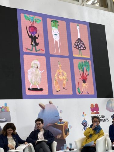
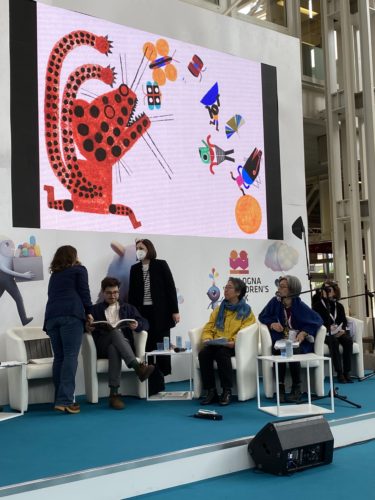
And in this one (this is great fun) it shows the importance of creating characters. They’re the protagonists of the story. And here we have characters made out of inanimate objects. When I look at this, I want to know more about the life of these characters. It’s very difficult to create this kind of characterization.
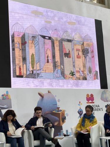
This was the illustrator we saw before. Again, what I said about the space is very important there.
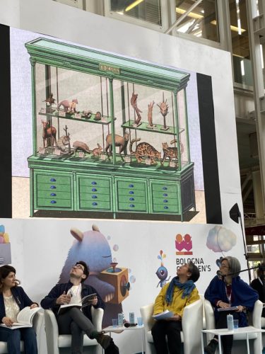
This is by Paige. This made me feel, as a reader, that I was going towards discovering new worlds. It made me reflect on the age of discovery. I felt a bit like Alexander von Humboldt. It made me think about us, very small people, in this vast universe we inhabit. And also because our life is changing so much with technology and during the pandemic, because of our role in the world and what we are doing. This is the question of this changing world. This is something we have to reflect on.
Marcella Terrusi: The eyes of the scientist is the eyes of the artist, both look at tiny details and the connections. Thank you for giving this as an insight into your way of looking and seeing images. I want to point out that the cover is by Elena Odriozola. What you find is a world of work in this book. It’s really a long process.
The past 2 years the process changed. The pandemic changed our lives and work but we didn’t stop and we invented new ways to do it. Normally what happens is we receive the thousands of submissions. 3,000 illustrations and then you have to come up with 78. Usually all the art is placed on tables and you get to walk amongst them. This had to change. Doing it online is very different and very hard. You had to go through it and at the end you finally met up. Do you want to mention something about the process?
Agata Loth-Ignaciuk: The first two rounds we selected online and it was a very hard process. There were 3,800 entries, so this took a lot of time. We saw the images only on the screen so this is a wonderful surprise to see all the illustrations in the exhibition put together. We are very happy with our work though we were very stressed how it would all look and work out. It was also a big day for us. I hope that the process will be easier and the next jury will see all the originals, but we’ll see how the pandemic goes.
Marcella Terrusi: As a publisher, how did you chose how your heart works?
Agata Loth-Ignaciuk: First was the first impressions. What I saw, whether I liked it or not. Then the more rational process started to work and I saw as a publisher. How the 5 images worked together. How the flow works. I chose just a couple to show you. It was a great experience to see these images from all over the world. You could feel the trends and some that worked better in other countries.
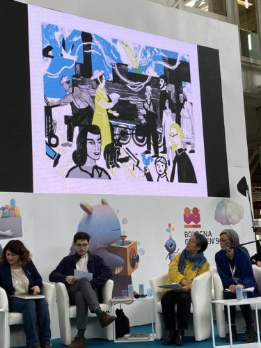
This is a Ukrainian illustrator. I liked the combination between the old fashioned printmaking techniques with modern coloring. It works well to emphasize some older techniques. We saw a lot of manual work this year.
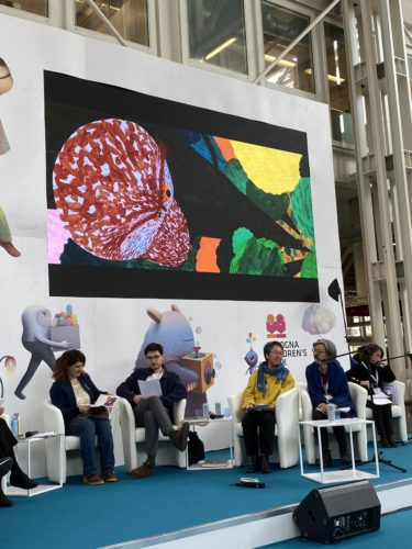
This is by Karen from Sweden. It is this cinematographic approach and framing. Such illustrations are for children watching fast things on screens. Combining this more modern composition, it’s a cinematic approach not often seen.
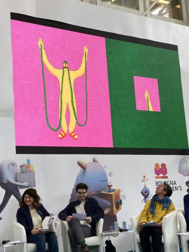
This is from Israel. It was more of a short story when we saw the 5 illustrations together. They didn’t really need any text. I like it because it is very symmetrical. There is a lot of harmony but the bold use of color makes it very dynamic and fresh. I think it’s a very simple funny idea conveyed. I like the diversity between the images. It shows you can make a story with very little means. I think it’s also a digital work, unlike the other more manual works.
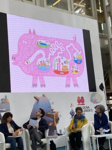
I love the way the characters are shown and this has this lightness and fun thing that we as publishers look for in children’s book illustrations. There should be entertaining stories and here the characters are really small but those illustrations really show their ability. It was fun.
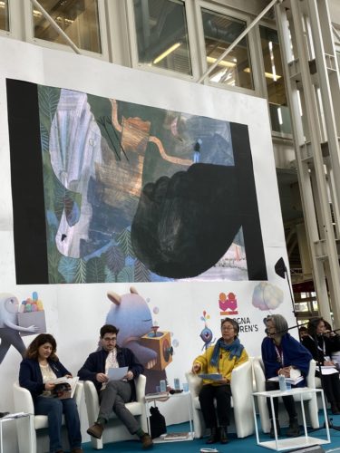
This is Mariana. This is an image that evokes a lot of emotions and leaves you a lot of space for interpretation. It’s a story about loss so there was also this continuity between the 5 images. A thread going through the whole story which was the connection between the different emotions you go through. This is one of the images and I found it very moving. Also this painting and collage technique all manually made, I found to be a good example of what we saw in the selection.
Marcella Terrusi: Thank you for mentioning illustrators from very different areas. We were thrilled when the fair was confirmed in January. Thank you for coming and thank you for trusting us and for submitting in this time of a pandemic. Our common work, yours, and ours, and all of us really, is building an international understanding/community. It is with emotion that I see illustrators with Ukraine being selected with illustrators from Russia. Because this is our community. This is a space where everyone has the right and the freedom to be with their art. I want to underline this. Maybe there was no need but I think we all have a heavy heart. We have to celebrate with this awareness. Thank you for the beautiful walk you took us on into your selections. In the process, everyone brings their own perspective. Publishers, editors and now we go to to the perspectives of an artist in illustration. I would like to ask you Nana what was your experience in the selection. How was it for you being asked to be on the jury? How was the selection individually and in the group?
Nana Furiya: It was my first time of experiencing something like this. I am also not the person selecting people but the one trying to BE selected. I have seen many very different kinds of exhibitions on illustration and sometimes I would think, “Why was this work selected for this exhibition?” This time I was able to experience the role of someone who selects people. All five of us are very different people. We have different perspectives, we like different things, but we all came together. We have selected all of these illustrations as one group united. So I might feel that and as we went through the 3rd round, all together, I saw how important it was to accept and understand the different jury members. For me this understanding was very important. How important it is to accept other perspectives, other points of view. Maybe that is how a group comes together and how a group becomes unified.
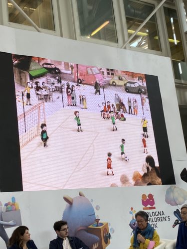
This is Raquel’s work. Some of my fellow jury members said that this style was something we’d already seen before, but it was selected at the end. Now there are very difficult issues for children in society. I thought that this was an example that narrates to children and helps them to understand these issues. And one other thing that I really liked about these works was that the characters were drawn in detail. In this illustration you can see that a soccer match is going on and you can see the players and also see the neighbors that have come to see the match, and also see that their relatives and family members are there. I would like to invite you all to come and see the originals and look very carefully. And if you look carefully you will find that there is a group of elderly people. There are plump people, thin people, and also some elderly people who have walking aids. And I thought that maybe there is also a girl amongst the players. This artist works very carefully on details that are interesting to children. So I think that children who read this book can understand in a very natural way that society is made up of very different people. But maybe my fellow jurists were right in saying that these illustrations do not have great impact. And the characters are drawn in a very simple, plain way. So I think that when you think about making books for children the theme is very important. It is also important to have books that show the personality of the artist behind the book project. It is also important to think of what you are trying to say in the book. So the reason why I chose these illustrations was I really appreciated that she used this very simple way to tackle a social issue and convey it in a very clear and natural way to children.
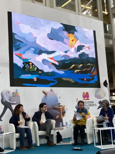
And then I have also chosen Charlotte Lemiare as one of my favorites. I was totally amazed by the illustrations the minute I saw them. I thought that the dynamic use of the brush and the color palette were amazing. In this landscape you can see many layers and a vast sky. It is typical of her style, following her instincts. The style might seem childish to some but you can feel a strange sort of magical realism to it. The space goes on, widening for eternity and you can feel a cold air penetrate and come upon you. And if you shift your gaze downwards you can see flowers and houses painted in a more illustration-like cute way. I was surprised to see that the dynamic style with the clouds goes very well with this nice detailed illustration contrasts with the painterly style.
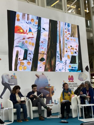
In this illustration you can see that people and small animals are drawn humorously and with real warmth. You can really relate to them. And in the illustrations you can feel also a kind of comic style. You feel that these images are based on her ability to observe nature. She is a very good artist. I learned that her dynamic composition layout of elements come from how she lays out the elements onto the page. I think that Charlotte’s works are composed of these three interesting elements. The first is the composition and the second is her harmonious use of color and then also these details and very cute illustrations. These three come together to create a wonderful work.
Marcella Terrusi: Valerio, you grew up in the Bologna Book Fair, so we saw your work mature. I wonder how your identity as artist and illustrator worked into the process of selection. Did you have one impression of all the images together? Maybe it was easier when you saw it in person?
Valerio Vidali: I thought this was going to be very easy. And suddenly it was very very difficult. I thought we are going to all sit down and watch the monitor and it will be very clear which ones were the beautiful ones. And in the end I felt stupid because I realized really how different was each one’s opinion. It was very interesting. A good learning experience to discuss and talk and try to understand what other people see when I don’t see something I like. When I was younger I was sending work to Bologna. Bologna has been very important to me, it’s a beautiful exhibition and such a big confidence booster. And so it was very nice to be on the other side.
Marcella Terrusi: When people submit they don’t know what kind of selection will be done. Every jury expresses its own tastes and ideas in this long process. And this exhibition is also a traveling exhibition. And it is made from the jury that selects and chooses it. I want to tell the illustrators not selected, don’t give up. This also gives the idea of the responsibility of the jury itself. What was your taste and what ideas changed when you changed you mind? What were you looking for?
Valerio Vidali: Actually I find it’s a bit difficult for me to answer this question because I don’t know. What is my criteria? What do I want? There are many illustrations I really loved but at the same time I didn’t think they should be in the exhibition. We could have done 10 exhibitions like this with the same quality. The way we choose things, it’s not like these are “the best”. This is our selection. When I came to Bologna my main focus was to give protagonism to the things I see less in the book market. Especially for young illustrators, the exhibition is such a reference that it changes the tendency for the next year. So when you see 4,000 illustrator awards in 3 days you realize how you want to highlight the outcasts. The ones doing things differently. I wanted to pick the ones that I think deserve the spotlight.
Marcella Terrusi: The word “originality” is a double-sided word. It is a dangerous one.
Valerio Vidali: The three I’m showing I picked because I wanted three very different ways to do things. I really love the traditional voice that she has. It’s all incredibly elegant. There’s a timeless feeling to it. I also love the riddle. Every page has very different narrative and feel.
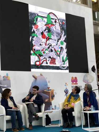
This is the work of Susan Young. I’m realizing now that maybe my interpretation of this drawing is very different from that of the author. This is is like an exercise in imagination. Two characters at a zebra pass. When we were children we played with not stepping on certain lines or colors like there were monsters there. Now I have some doubts, because there’s a fishing rod and some kind of purpose. You always want to have movement and big changes from one page to the next. It’s like an animation. You follow all the changes and the richness and the texture is very graphic but at the same time is very pleasant to the eyes.
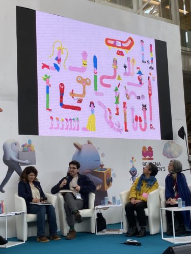
I think she’s hilarious. I feel like we are all trying to do very poetic books but I really love very funny books. We should all try to do more funny books. For me, it reminded me of Richard Scarry’s books with many details and many little storylines and references. I have a few of her books and I think she is very funny and I think funny has great merit in literature for children.
Marcella Terrusi: I want to underline what you just said. To talk and to think about the universe of the child. Funny books are so important. I want to say that this book was also mentioned with the nonfiction books. It’s a nonfiction book about worms. We have some rules in mind when we talk about the art of picture books. Sendak would say you have to put the dynamism of the child into the book. But Valeria said you can make the rule and also break the rule.
I know the jury had to come a narrative connection between the 5 illustrations submitted. So in the 5 artworks there has to be a story. Not a person walking and arriving but a narrative universe that takes the readers from one point to another. I would like to hear from Barroux (Stephane-Yves Barroux is his real name). You have very special technique and a recognizable style in your books. How was your experience? Are there points you liked or that we’ve been missing about this process?
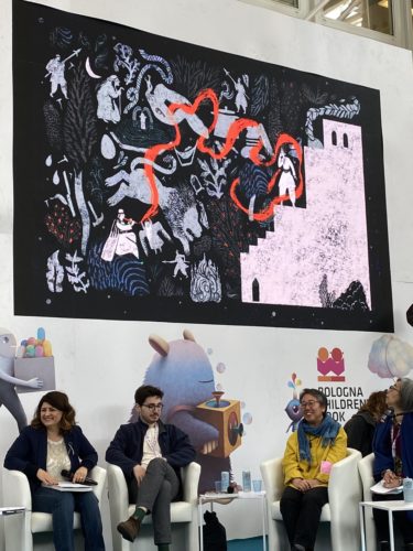
Barroux: For me it’s the idea first and when I read these stories for the first time some images come to my mind. The best technique to give in to the motion of the text. That’s what I want to say about the exhibition. There is a lot of creativity and diversity and it was one of our points. As you say, this was almost 4,000 pictures sent to the Bologna Book Fair. In the middle of all of this, how do we chose some of them? In a way, very creatively. That’s why I’m very proud of the selection.
Marcella Terrusi: Diversity is a beautiful criteria nowadays. But you also express the personality of the jury. How did you make your selection?
Barroux: To be honest, I really don’t know. I think for sure I like the composition which does this picture takes some risks. I love the way she draws things. But what I want to say is to young illustrators in the audience. You should take some risks. You should be creative and find a new path. It’s about emotion. A picture could be well done but there is no emotion or poetry coming from it. To the young people starting, there are lots of new paths to explore. Be curious and be creative. This year we got a huge selection. Maybe in 10 years it’ll be 10,000! I know it’s difficult to find your own style sometimes. Sometimes it takes time. You can get it wrong because sometimes when you get something wrong, put it behind you and try again. It’s just paper. It’s just words. It’s not that important. Three years ago a young illustrator called me crying on the phone saying he was in a prestigious illustration school in France. “I don’t have any style!” I said, “Yeah, but you’re in a very good school. How old are you?” He said 21. I said, “You have time to do things. Be curious and be creative.”
Be curious and creative, folks. Barroux knows what he’s talking about.
Filed under: Bologna Children's Book Fair
About Betsy Bird
Betsy Bird is currently the Collection Development Manager of the Evanston Public Library system and a former Materials Specialist for New York Public Library. She has served on Newbery, written for Kirkus, and has done other lovely little things that she'd love to tell you about but that she's sure you'd find more interesting to hear of in person. Her opinions are her own and do not reflect those of EPL, SLJ, or any of the other acronyms you might be able to name. Follow her on BlueSky at: @fuse8.bsky.social
ADVERTISEMENT
ADVERTISEMENT
SLJ Blog Network
I Need to Stop Pretending Roald Dahl Wasn’t Problematic
Papercutz to Publish ‘Midnight Island’ | News and Preview
From Policy Ask to Public Voice: Five Layers of Writing to Advance School Library Policy
Fast Five Interview: Candace Lee and Eric Newman
ADVERTISEMENT


This is my favorite excerpt from the entire (fascinating) piece!
Valerio Vidali: I feel like we are all trying to do very poetic books but I really love very funny books. We should all try to do more funny books.