Review of the Day: Opposites Abstract by Mo Willems
Opposites Abstract
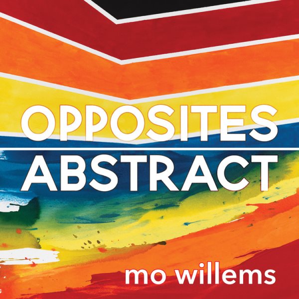
By Mo Willems
Hyperion Books for Children
$14.99
ISBN: 978-136807097-3
On shelves October 19th
Reviewing Mo Willems is kind of like poking at a very big, very colorful wall. The wall isn’t really going to care if you poke it or not and unless you continue poking for years at a time, you’re probably not going to make much of a dent in it. Now I just checked and rechecked my notes and as far as I can tell, the last time I reviewed a book by Mo Willems was on January 29, 2007. I believe it was the very first Elephant & Piggie books My Friend Is Sad and Today I Will Fly. In the intervening 14 years I’ve not felt a particular desire to review him again. Mo’s already famous, so highlighting his work won’t cast a light on an unappreciated artist. I already did Elephant & Piggie once, so any subsequent books would just be window dressing. As for Mo’s other forays into children’s literature, he’s curious to watch. I was intrigued by his willingness to have other artists illustrate his books (Jon J. Muth, Tony DiTerlizzi, Amber Ren, etc.) but I bided my time. Seems to me, once a picture book creator hits a certain level of fame and fortune, you wait. You wait until they try something new and different. And if that wait means you end up reviewing a book made up of 40” X 40” acrylic paintings, then by gum so be it. I have been very patient and now, for the first time in a long while, I’ve crawled out of my hidey-hole to give the newest Mo Willems book a bit of a sniff. It does not look like his other books. It does not sound like his other books. It is simple. It is colorful. It is interesting. And best of all, it gives kids and their parents something to talk about. And considering how much time we’ve spent together mid to post-pandemic, that’s something.
I think we all know what to expect from an opposite book by now, but concept books are catnip to bored book creators, and Mo Willems is no exception. The first thing you see when you get to the title page is a painting on the left-hand side. A thick brushstroke of green/black/blue and a squared off thinner stroke of black appear on a white square. “This Is Starting” says the text. And we’re off! From here on in you will generally see text on one page and an image on the other. Before you’ve time to process the image before you, you are asked a question. “Is This Dark?” The picture may resemble an eclipse, black on white on black. What do you say? Is it? Why or why not? Turn the page and there’s a white circle on a gray background. “Is This Light?” Again, you need to figure out how you want to interpret the image. Eighteen paintings will ask you questions eighteen times. Some will be easy and some will be difficult but all will be entirely subjective and up to the interpretation of the reader. And when you have gotten to the end, and there are no more questions to be asked, you see a green/black/blue square within a black outline and words that brook no argument. “This Is Finished.”
ADVERTISEMENT
ADVERTISEMENT
I’m going to cut to the chase with this review, because you probably saw the word “Abstract” in the title and your warning signals got triggered. Abstract? Ruh-roh. I will now ask the most important question: Is this book kid-friendly? This is where the rubber meets the road, people, because Mo’s trying to have his cake and eat it too. He wants to create a book of abstract art for kids while maintaining a concept book of opposites. What’s interesting with all of this is that I think the book works on a couple of different levels. Let’s just go with the simplest one. You hand this to a small child. They page through it. And because of the format and the colors and the images, there’s a lot to see. So just on a visceral level, it’s enticing to the eye. Then there’s what happens when you read the book with a child. You can discuss just the basic opposites, but since every single page is a question rather than a statement, you’re naturally being led into a discussion with your kid. “Is This Soft?” asks the book? Talk about it for a bit. After all it’s not like you’re going to need an art degree to have a talk with your child. Finally, let’s look at this book as a collection of abstract paintings. Because why the heck limit yourself to the questions on the page? Find out what the kids think about the art. Flip to the back of the book where they show the opposite pairings and talk about that. Ask them what painting they like the most (and ask which one they like the least). You have options.
I should mention that while the original art for this book is 40” X 40”, the actual book itself checks in at a handsome 8” X 8”. It’s a square little number, a shape that I’ve always been intrigued by in picture books. Willems himself broke onto the scene with the square Don’t Let the Pigeon Drive the Bus, which was an uncommon shape at the time. By making this book also square, each painting fits perfectly in the center of its page. Once I’d realized that, I took a couple passes on the book to see what it was up to. I paid attention to the background colors behind the words and behind the paintings, but didn’t get anywhere with that. Though your eye may search for patterns, these particular colors don’t follow anything you recognize.
It wasn’t until I flipped to the back cover of the book that I saw a presentation of the images inside paired together. Interestingly, you get a very different view of the book when it’s laid out in this way, and I spent an inordinate amount of time trying to figure out if I liked the paintings better the way they are in the book or here next to their pairs. Generally speaking, I like that the book dedicates two full pages to a single image. This design choice keeps the reader from splitting their attention. Had Mo put each painting on a page opposite its opposite, your attention would have been cut in half by necessity. You could never have looked at the paintings as individuals but as pairs, which I suspect would undermine the whole dang point of the exercise. Makes sense, right? Except . . . there is one place where he does put two paintings in a single two-page spread. It’s right smack dab in the center of the book and the words read, “Is This Inclusion? Is This Exclusion?” And gentle reader, one cannot help but think that these questions bear more weight than many of the others. Once that question has been answered, the book makes a shift. The paintings that previously appeared on the right-hand pages are now all on the left-hand pages. Not a political statement, but edging that way. Definitely edging that way.
So, brass tacks here, what exactly is Willems trying to do with this book? I mean, obviously it is (as he has said) “a concept book, abstracted”. So has he entered the Chris Raschka/Herve Tullet point in his career where art and picture books mix and meld in a variety of ways, some successful, some not? I mean, I’m curious because Mo’s career is unlike anyone else’s. He has experienced massive fame during his lifetime and during his creative period, and a lot of his energy has been dedicated to the price of what goes with that. But like everyone else, the pandemic stifled Mo. He was supposed to be the Kennedy Center’s inaugural Education Artist in Residence. There were going to be appearances and performances and theater and music and what he calls “live experiments”. Then COVID hit and he got stuck home like the rest of us. He compensated with videos where he might, for example, paint while listening to Yo-Yo Ma (which is to say, the actual Yo-Yo Ma playing right there on a video call). Looking at this kind of art, it really ties into this book so nicely. What’s he trying to do with this production? Impossible to say. Maybe he wants to instill in your children a kind of proto-appreciation for abstract expressionism. Maybe he wanted to take a concept book and turn it on its head. Maybe he wanted to paint great big pictures and then find some use for them. Maybe.
There is no particular reason to compare this book to anything else out there, but my brain is kind of a jerk and sort of gives me readalikes unbidden, whether I want them or not. And by gum the books I kept thinking about as I read this were the very French Hippopposites by Janik Coat and Pomelo’s Opposites by Benjamin Chaud and Ramona Badescue. Those books are also concept titles, but what makes them interesting is that they allow the reader to disagree with the opposites they choose. Pomelo in particular stretches the very idea of opposites to the breaking point. So when I read Mo’s book and hit the questions that accompany each page, it occurs to me that every time he asks the kid “Is This Broken?” or some similar question, he’s not requiring the child to agree. He gives them room to think for themselves. Many (most?) kids will simply nod with the book, but for the kid willing to question the world they’ve been handed, these open-ended questions will be key.

Here’s a tip: kids will enjoy Opposites Abstract if you enjoy it. I’m pretty sure if you give it a good reading, they’ll be on board. So no reading this book like it’s a chore, people. Seriously, I see those of you out there who zeroed in on the word “Abstract” at the beginning of this review and got that feeling in the pit of your stomach that your schooling failed you. This book doesn’t care if you know your Helen Frankenthaler from your Beauford Delaney. The work’s been done for you. So if you just want to plunge your eyes and brain into something strange and strong, this foray into the intangible is worth your while. And honestly, if this is the direction Mo’s going to go in for a while, climb on board. THIS is interesting.
On shelves October 19th.
Source: Galley sent from publisher for review.
Filed under: Best Books, Best Books of 2021, Reviews, Reviews 2021
About Betsy Bird
Betsy Bird is currently the Collection Development Manager of the Evanston Public Library system and a former Materials Specialist for New York Public Library. She has served on Newbery, written for Kirkus, and has done other lovely little things that she'd love to tell you about but that she's sure you'd find more interesting to hear of in person. Her opinions are her own and do not reflect those of EPL, SLJ, or any of the other acronyms you might be able to name. Follow her on BlueSky at: @fuse8.bsky.social
ADVERTISEMENT
ADVERTISEMENT
SLJ Blog Network
Books to Celebrate National Poetry Month 2026
Born in the USA | Review
From Policy Ask to Public Voice: Five Layers of Writing to Advance School Library Policy
Different Kinds of Funny: Character Humor for Middle Grade Readers, a guest post by Laurie Morrison
Sara Pennypacker visits The Yarn
ADVERTISEMENT
Interesting review. . . you have me intrigued.
Excellent review, as always; can’t wait to see the book!
I have to wait till October to see this? Waaaah! Great review!