Un Cri de Coeur: The Masses Demand New Book Jackets (Please?)
Here we are on the cusp of summer. It always surprises me when the weather gets warm and yet the kids are still in school here in NYC. Still, they’ll be out soon enough, running into my libraries with their summer reading lists clenched in their hot little hands. Here in New York City each school, each teacher even, can have their own reading lists. There is absolutely no consensus amongst them. Some things in life are certain, however. By and large, the same books show up over and over on the lists.
With all this in mind I received the following message from a fellow children’s librarian. As her crie de coeur says, there are few things quite as disappointing in life than handing a kid a book only to see their face fall in despair when they see the cover. Or, as she put it:
ADVERTISEMENT
ADVERTISEMENT
I am building a book order to replace some terrific—and completely unread—books in my elementary library, and I just wanted to take a moment to rant about book covers.
I want to replace these books with new copies with covers that might actually attract children:
Dear Mr. Henshaw
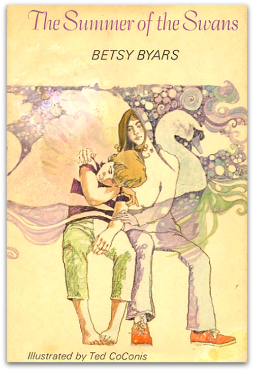
Summer of the Swans
From the Mixed-up Files of Mrs. Basil E. Frankweiler
The Giver
I’m sure there are more. But alas, I cannot replace these books with new copies with more attractive covers, because an attractive cover does not exist. ARRGGHHH!
Why won’t someone somewhere create covers equal to the quality of these books?? If no one does, they are doomed to a listless life on the library shelf, pulled out only far enough for the cover to be seen, then summarily shoved back into their shelf slots. What an injustice.
Hmm. Each one of these is a classic and in some cases their covers are considered untouchable by the masses. But no book jacket is so perfect that it couldn’t stand an upgrade. Let’s take a look at the offenders, shall we?
Ah, Mr. Henshaw. Now not all of us know this, but this art was actually done by the great Paul O. Zelinsky back in the day. It’s a lovely cover . . . if you live in 1983. It’s that bowl haircut that does it in now. For a second that haircut came back in, but not any longer. You could certainly keep the interior art if you were married to it, but that cover could stand an upgrade, yep.
A 1971 Newbery Award winner and a book that has not fared well in the old book jacket department. As you can see, it’s going the boring dreamy route. Past covers have been little better. They have included:
We’re not looking for anything crazy. Just a cover that feels like it belongs in the 21st century.
By the way, back when Travis Jonker was bestowing new covers to old Newbery winners, he included this book. You can see his results here (and it’s still better than what we currently have).
ADVERTISEMENT
ADVERTISEMENT
This one is going to raise some hackles. After all, Ms. Konigsburg illustrated this cover herself, and some folks have a real, personal connection to it. Interestingly enough, there have been other iterations of this cover. Three of the alternative covers were just variations on the same theme (making this cover a photograph rather than a drawn image, but retaining the look). You can see them in my summary of this book as part of my Top 100 Children’s Book Poll. Only one cover has been significantly different and it was this one:
Seems to me another upgrade would be well in order. Like my librarian reader, I too have had difficulty hand selling this book thanks in large part to its cover design.
And finally . . .
You may recall that just as Ms. Konigsburg did her cover, so too did Lois Lowry take this photograph. The book has seen other covers over the years, but none of them are what you might call particularly thrilling.
This one doesn’t bother me the way the others have. I hand this book to kids and they don’t cringe. More to the point, the upcoming movie has created a new cover. Voila:
I don’t mind it, but I could have lived without the gigantic sticker on the cover mentioning Taylor Swift.
What are some book jackets of days of yore that you wouldn’t mind seeing repackaged?
Filed under: Uncategorized
About Betsy Bird
Betsy Bird is currently the Collection Development Manager of the Evanston Public Library system and a former Materials Specialist for New York Public Library. She has served on Newbery, written for Horn Book, and has done other lovely little things that she'd love to tell you about but that she's sure you'd find more interesting to hear of in person. Her opinions are her own and do not reflect those of EPL, SLJ, or any of the other acronyms you might be able to name. Follow her on Twitter: @fuseeight.
ADVERTISEMENT
ADVERTISEMENT
SLJ Blog Network
One Star Review, Guess Who? (#211)
Kevin McCloskey on ‘Lefty’ | Review and Drawn Response
Notable NON-Newbery Winners: Waiting for Gold?
The Seven Bills That Will Safeguard the Future of School Librarianship
Take Five: Newbery Picks, Part Two
Gayle Forman Visits The Yarn!
ADVERTISEMENT


The anniversary edition of “Mixed-Up Files” is a little better: http://www.amazon.com/Mixed-up-Files-Mrs-Basil-Frankweiler/dp/1416949755/ref=sr_1_1?s=books&ie=UTF8&qid=1401360426&sr=1-1&keywords=from+the+mixed+up+files+of+mrs+basil+e+frankweiler
Yep, but it’s still the same image. They just sort of moved them into the museum from outside the museum. But it’s the same shot from the back. Seems to be about as creative as they’re willing to get these days.
Here’s the cover design I did for fun for The Mixed-Up Files… one of my absolute favorite books!
http://mattroeser.com/From-the-Mixed-Up-Files
I like it!
Oh, I like it too. But then, I’m a librarian with a love of files. This taps into my pre-existing adoration of tiny drawers and labels.
That cover design is very, very cool.
I like it, too!
For the last few years I’ve challenged my 4th graders to redo covers for our library’s cringe-inducing books. Sometimes they even come up with redos for books that I think are already great! A student redid Jake and Lilly last year after I told her I would never be willing to re-cover it, and wouldn’t you know it, I loved her cover. So far the kids have recovered (and completely resuscitated) Harriet the Spy, Summer of the Swans, Follow My Leader, Hurry Home Candy, Charlie and the Chocolate Factory (I know, but I went along with it), and The Witch of Blackbird Pond. My rule is that they have to read it and love it before they even start working on it, and I’m pretty hard on them when they bring me their first sloppy drafts. Once I’m satisfied with it, I laminate the new cover and tape it right over the top of the old one. They are always SO proud! And the books always get a tremendous boost in readership. Three years ago I couldn’t PAY anyone to read Harriet the Spy. Now even the boys do! Win-win!
How about the cover of Strawberry Girl – talk about a turn off.
Oh, that sequence of Summer of the Swans covers was painful! Also, another Betsy Byars’ book The Midnight Fox is in dire need of a new cover. And what about The Avion My Uncle Flew? Who would ever read it?! Down with frumpy book covers! My daughter used to cover them up with brown paper cut from grocery sacks because she couldn’t bear to see them!
OH, how I LOVED that Avion… and I have a weird cover with a weird plane from when I was a kid. It was… a weird cover, but I was entranced by its weirdness, because FRENCH! I was sure that’s what all the French kids were reading. Hah.
Meanwhile, I HAD that fourth SUMMER OF THE SWANS cover; The Travis Redo beats everything here, hands down.
I want to retitle this post “Down With the Frumpy” now. Dang. Good call.
Who is the brilliant, frustrated librarian you quote? I agree wholeheartedly with the titles she lists as outstanding but with covers that totally lack “kid appeal.” I could add a lot of others to the list as well. Sometimes I can’t help wondering if certain design and art editors at children’s publishing houses have engaged with a child in the last 40 years!!!
I figure if the librarian wants to out herself here in the comments she can certainly do so, but I can’t reveal her myself. And for the conspiracy minded amongst you, she isn’t me.
When I came into my first position, about 20 years ago, the previous librarian had allowed a volunteer to cover all the books with new dust jackets—made out of 70s wallpaper with greeting cards cut out to provide the picture, handwritten titles (sometimes on separate paper) and then covered again with a plastic jacket. My jaw dropped in horror. Not only were they completely ugly, but they added about a eighth of an inch of paper to every book.
I ripped them all off, even though it meant that some books were down to a blank cover. It was still better than what I had removed!
Covers really do make a difference
When I was in high school (vocational/technology high school), one of my assignments as a graphic design student was to choose a book the librarians pulled – something classic but un- or under-circulating because it had a bad, old, ugly or ripped, wet, ruined cover – and make a new dust jacket. It was great experience for the student designers, and it helped the librarians: they got spiffy, updated covers without needing to replace perfectly good books. Circulation usually went up after the redesign, because they looked newer and nicer – and they got a sticker and a special display shelf for the first few weeks or months after, “designed by a Center for Technology student!”
I’m talking with our secondary principal to get an assignment like this on the list for our art students’ volunteer projects, because I have a list like this of books that are amazing, but I just can’t get students to borrow because they look uncool.
Jill and Tanita are right, The Avion My Uncle Flew is terrific. I learned this when I read the book after being asked to create new cover art for it for a Walker Newbery reissue back in 2003. I’ve winced when thinking about that cover for eleven years now — it was a total dud. I don’t know who has the rights to Avion these days but from me they have a standing offer for a redo at a substantial discount.
*breaks leg in attempt to run out the door and locate Floca jacket illustrated copy of The Avion My Uncle Flew*
“Dud” and “Brian Floca” in the same sentence? I am highly skeptical.
I see a new contest in the future! This was my first year and I offered the bookmark design contest of my predecessor because the kids love it (winners at each grade level get made into bookmarks for the entire grade). THIS sounds even cooler–the addition of a reading and design competition! Take 10-15 books that desperately need new covers; kids design as many as they want (added bonus of the challenge to read more than one). Winners become the new covers! Thank you; thank you!