Artist and Art Director In Conversation: Nancy Vo and Michael Solomon Discuss Process, “Pastness”, and Palette
Behold:
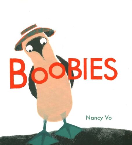
Now that I have your attention, I am delighted today to introduce two guests to this site. Nancy Vo, the author/illustrator of aforementioned Boobies, is coming out with the finale of her Crow Stories trilogy today, August 6th. The book is called The Runaway, out from Groundwood Books, and is, as SLJ called it, “a deeply felt story that will provide rich opportunities for children to extend the storytelling and perhaps tell their own survival stories.” Previous picture books in this trilogy include The Outlaw and The Ranger. If you’re unfamiliar with the series, they’re a rarity in the world of children’s picture books, to say the least. Each feels like a short Western film, set against a bleak, but oddly hopeful, landscape. They are the rare picture books you could read just as easily to a 5-year-old as a 95-year-old and both people would get something out of them.
In celebration of its publication day, Nancy’s long-time Art Director, Michael Solomon, is here to ask Nancy a few questions about her artistic process in this series, and across her larger body of work.
ADVERTISEMENT
ADVERTISEMENT
To preface this conversation, and to give a bit of background, here are the plots, as put forth by their publisher, of each of the books under discussion today:
The Outlaw

In this spare and powerful story set in the Old West, people in a small town live in constant worry of another visit from the Outlaw. Then the Outlaw suddenly and mysteriously disappears. Time passes, and one day a stranger rides into town. He takes it upon himself to fix everything that is in disrepair — the clapboard schoolhouse, the train station platform. He even builds a horse trough. But when someone recognizes him as the Outlaw, the crowd turns on the stranger. It takes the courage of a small boy to change the course of events …
The Ranger

In this memorable and beautifully illustrated story, a ranger comes across a fox caught in a trap. The ranger frees the fox and promises only to tend to its wounds. The fox recovers and remains curiously close to the ranger, and when unexpected twists occur, the fox ends up being the helper. The ranger asks the fox, “Does this make us even?” and almost immediately feels regret—keeping score has no place in friendship. And so the two continue their journey together.
The Runaway

When a young boy loses his mother to cholera, he is convinced he must leave home. He is fearless, resourceful and, above all, determined to find what he is looking for. When his hunger gets the best of him, he agrees to join two riders who take him to their encampment. The boy is soon put to work for his soup and bread, and time passes, though he holds fast to his purpose. Then just when he is ready to set out again, he finds there is no need …
It is not often that I’ve a chance to get this kind of background information on the coordination and cooperation that an Art Director and an author/illustrator have to do when getting a book ready for publication. I hope you find this just as eye-opening as I did.
Take it away, Michael!
Michael Solomon: Hi Nancy! Congratulations on The Runaway! Its appearance completes the Crow Stories trilogy. Now that we have the three stories as a set, I’m prompted to ask how closely the narratives adhere to an overarching conception, or did they take on independent directions as you wrote? The Outlaw ends with a tentative sentence beginning “And maybe …” That seems to me a touchstone of sparseness and obliqueness in the storytelling that unites all three. Was this open-endedness something you had in mind from conception? And how did such a text influence your approach in illustrating it?

Nancy Vo: Hi Michael! Thank you! Can you believe that we’ve now worked on five books together? I remember that first nervous day for me: You, Sheila, Nan and Emma were gathered around your desk to talk about the first book in the trilogy — my first book to be published — The Outlaw. You showed us a collection of hand-mixed ink pens, talked about drafting tools and letterpress, and I knew that the book was in good hands. But I haven’t even answered your question.
I offhandedly proposed the idea of a trilogy and team Groundwood said, “Sure, why not?” BUT I didn’t have any idea what those stories would be. I was totally shooting from the hip. And your reference to sparseness in storytelling is part of the appeal of the Western genre for me. A lot is said without saying it aloud. In spaghetti Westerns, landscapes seem to “speak”. And even the attitudes of characters in these stories seem to say a lot. A little less conversation please, well before Elvis.

No, I didn’t have all three stories figured out from the beginning. I was reading and watching Westerns at the time. The Outlaw was loosely inspired by the conundrum faced by Eli’s character in Patrick deWitt’s The Sisters Brothers. The Ranger came quickly on the heels of The Outlaw and was loosely inspired by the strong-willed Mattie Ross of Charles Portis’s True Grit. However, I went through several failed attempts at a story before coming up with The Runaway.
As for open-endedness, I like stories that leave room for me to reflect after I read them, so I hope that I do the same when I make picture books. The crow appears at the start and leaves at the end of each story, relaying to the reader, “Your turn.”
Michael: The reappearance of Annie in The Runaway weaves the second and third stories together in a captivating way. Was her continued presence something you had in mind when you started to write?
Nancy: I’ve told people that The Runaway started out as a conversation about whether there were cults during the mid 1800s. However, I think the seed for the idea happened when a class of Grade four students were tasked with coming up with their own extended versions of The Ranger. What ran through nearly all their stories was that Annie and the fox live in a house. I hadn’t thought of the idea of “home” while trying to work out the idea of their friendship. The Runaway gave me a second chance; I could make the sister be Annie rather than a random new character.

Michael: The books are also united by their techniques, most strikingly in their restricted palette of earth, ash and straw colours. One immediately thinks of themes of memory, the past and history. Did these themes influence the colour choices?
Nancy: Once I am immersed in learning about a place and time, I can go down rabbit holes. At some point it becomes procrastination, I know. Anyway, I knew indigo was one of the earlier dyes used in cloth. So the limited colour palette had indigo as the starting point and then I added two more colours. Raw umber and quinacridone gold seemed to enhance the indigo. If this palette evoked a sense of the past and history, then it worked out.
Michael: The old newsprint transfers are also a salient part of the atmosphere of the scenes. What inspired you to adopt that medium?

Nancy: This is a throwback to days in architecture school when CAD was still in its infancy, and we had learned the magic of acetone marker transfer. The acetone transferred lettering looked less mechanical than Letraset to some of us. So, for picture books, I used articles from my research to transfer as texture and shadows onto the ground.
Michael: You participated keenly in the typography aspects of the books, and of course you commissioned the beautiful moveable wood type title treatments. How do you see type as an element that harmonizes with or comments on the story themes, the sense of history, etc.?
Nancy: A few years before I made The Outlaw, I took a class on typeface and another class on letterpress. I thoroughly enjoyed both classes learning how to set type, mind my p’s and q’s, put type in lockdown and make prints! I gained a new appreciation for how type is used in design. I know people do entire postsecondary degrees on typography, whereas I only know enough to be dangerous. I commissioned the title type for all three books from a local press. Well, two local presses. The first one closed during the pandemic, but the second press inherited the type and presses from the first. Blackstone and Porchlight Press both had movable wood type from the late 1800s which bears nicks and scars from long use.

As for body text, I must have been a pain to work with, Michael, because I remember asking you if we could use Clarendon for The Outlaw, since that was a type that was available and commonly used during the 1850s in Wanted posters. For The Ranger, Caslon was from the same period and a more elegant option for Annie and the fox. Did we use Caslon again for The Runaway?
Michael: Yes. I forget the other text font you had in mind, but eventually you decided it was too delicate and spidery to stand up to the art grounds; so we went with the tried and true!

The soft palette and the text-transfer technique also occurs in a quite different book, Sarah Ellis’s As Glenn as Can Be. Again, did the “pastness of the past” inspire this direction, or did Glenn bring other notions that you were trying to express?
Nancy: Ah, Glenn Gould. His two favourite colours were midnight navy and battleship grey. I cheated and used indigo for midnight navy and was able to get away with kyanite for the grey. Pops of quinacridone gold were used to emphasize moments of joy or contentment, even though I don’t know his regard for that colour.
I approached the illustrations for As Glenn as Can Be differently. I wanted to add another layer to the story that Sarah was telling. As it turns out, Canada came of age at the time that Glenn came of age. So I was able to sneak in images that could be part of Canadian history, such as the flag Canada used before the maple leaf, or the CBC radio announcements that Glenn might have heard announcing WWII, or the RC Harris Water Treatment Plant under construction a kilometer away from his childhood home, or that his music is somewhere outside the solar system on one of the two Voyager satellites.
ADVERTISEMENT
ADVERTISEMENT
Michael: Finally, Boobies gives us another Nancy entirely. The palette is still restricted, but lively red-orange and teal-blue local colours cheer up the rich blacks and neutrals. And there is the lino print textures which keep everything looking very handmade. Obviously a different look seemed warranted by the text. Was the joy and humour of the writing the driver of these particular choices?

Nancy: Boobies did require a different treatment. I made an early dummy using watercolour and it really was NOT the right look. Too realistic when it needed a more comic tone. Stencils have a simplifying and flattening effect, which supported Boobies better (oh boobie puns abound). I had a lot of fun stencilling and the colours do pop out. Like boobies (. )( .)!
I mean, if you’d told me that today’s discussion would do a deep dive into text-transfer techniques and how quinacridone gold that can enhance indigo on the one hand, and then end with emoji boobs on the other… well, I’d tell you that that was a damn good dialogue, honestly.
The Runaway is out today, but be sure you check out all the books in the series if you can. Many thanks to Michael Solomon and Nancy Vo for their incredible discussion, as well as Kirsten Brassard and the team at Groundwood Books for putting it together.

Filed under: Interviews
About Betsy Bird
Betsy Bird is currently the Collection Development Manager of the Evanston Public Library system and a former Materials Specialist for New York Public Library. She has served on Newbery, written for Horn Book, and has done other lovely little things that she'd love to tell you about but that she's sure you'd find more interesting to hear of in person. Her opinions are her own and do not reflect those of EPL, SLJ, or any of the other acronyms you might be able to name. Follow her on Twitter: @fuseeight.
ADVERTISEMENT
ADVERTISEMENT
SLJ Blog Network
The 2025 Unicorn Report
Underground, vol. 1 | Review
When Book Bans are a Form of Discrimination, What is the Path to Justice?
Girls Posing as Boys: Stories Still Worth Telling? A guest post by Linda Joan Smith
ADVERTISEMENT

